Widget_type
- class Widget_type
- class div
An alias of Div
- text: str = ''
necessary_param, the text or HTML contents of the widget.
- disable_math: bool = False
core_param, whether the contents should not be processed as TeX/LaTeX input.
Widget_type.divexamplefrom bokeh.io import show # for quick testing, not necessary in scPantheon extension from scpantheon.buttons import Widget_type, make_widget Div_wid = make_widget( Widget_type.div, text = '\( e^{i\pi} + 1 = 0 \)', disable_math = False ) show(Div_wid) # for quick testing, not necessary in scPantheon extension

- class text
An alias of TextInput
- title: str = ''
core_param, label of the widget.
- value: str = ''
core_param, initial or entered text value. Change events are triggered whenever <enter> is pressed.
Note
Although bokeh also provides parameter
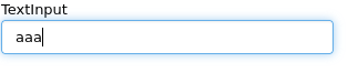
value_inputthat corresponds with change events triggered whenever any update happens (i.e. on every keypress), we only support change events triggered whenever <enter> is pressed by parameter text.value. You are not recommended to use the parametervalue_inputWidget_type.textexamplefrom bokeh.io import show # for quick testing, not necessary in scPantheon extension from scpantheon.buttons import Widget_type, make_widget args_text = { 'value': 'aaa', 'title': "TextInput", } def callback(): pass TextInput_wid = make_widget(Widget_type.text, callback, **args_text) show(TextInput_wid) # for quick testing, not necessary in scPantheon extension
- class button
An alias of Button
- label: str = 'Button'
core_param, the text label for the button to display.
Widget_type.buttonexamplefrom bokeh.io import show # for quick testing, not necessary in scPantheon extension from scpantheon.buttons import Widget_type, make_widget def callback(): pass Button_wid = make_widget(Widget_type.button, callback, label = "This is a button") show(Button_wid) # for quick testing, not necessary in scPantheon extension

- class select
An alias of Select
- options: Either(List, Dict(String, List)) = []
necessary_param, Available selection options. Options may be provided either as a list of possible string values, or as a list of tuples, each of the form (
value,label). In the latter case, the visible widget text for each value will be corresponding given label. Option groupings can be provided by supplying a dictionary object whose values are in the aforementioned list format.
- value: str = ''
core_param, the inited or selected value.
- title: str = ''
core_param, widget’s label to display.
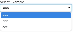
Widget_type.selectexamplefrom bokeh.io import show # for quick testing, not necessary in scPantheon extension from scpantheon.buttons import Widget_type, make_widget args_sel = { 'options': ['aaa', 'bbb', 'ccc'], 'value': 'aaa', 'title': 'Select Example' } def callback(): pass Select_wid = make_widget(Widget_type.select, callback, **args_sel) show(Select_wid) # for quick testing, not necessary in scPantheon extension
- class autocompleteInput
An alias of AutocompleteInput
- completions: List = []
necessary_param, A list of completion strings. This will be used to guide the user upon typing the beginning of a desired value.
- min_characters: PositiveInt = 2
core_param, The number of characters a user must type before completions are presented.
- case_sensitive: bool = True
core_param, Enable or disable case sensitivity.
- title: str = ''
core_param, widget’s label to display.
- value: str = ''
core_param, Initial or entered text value. Change events are triggered whenever <enter> is pressed.
Note
Although bokeh also provides parameter
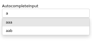
value_inputthat corresponds with change events triggered whenever any update happens (i.e. on every keypress), we only support change events triggered whenever <enter> is pressed by parameter text.value. You are not recommended to use the parametervalue_inputWidget_type.autocompleteInputexamplefrom bokeh.io import show # for quick testing, not necessary in scPantheon extension from scpantheon.buttons import Widget_type, make_widget args = { 'completions': ['aaa', 'aab', 'vafg'], 'value': 'aaa', 'min_characters': 1, 'case_sensitive': True, 'title': "AutocompleteInput", } def callback(): pass autocompleteInput_wid = make_widget(Widget_type.autocompleteInput, callback, **args) show(autocompleteInput_wid) # for quick testing, not necessary in scPantheon extension
- class checkBoxGroup
An alias of CheckboxGroup
- labels: List = []
necessary_param, list of text labels contained in this group.
- active: List = []
core_param, the list of indices of selected check boxes.
Widget_type.checkBoxGroupexamplefrom bokeh.io import show # for quick testing, not necessary in scPantheon extension from scpantheon.buttons import Widget_type, make_widget def callback(): pass CheckboxGroup_wid = make_widget( Widget_type.checkBoxGroup, callback, labels = ['option_1', 'option_2', 'option_3'], active = [0, 2] ) show(CheckboxGroup_wid) # for quick testing, not necessary in scPantheon extension

- class radioButtonGroup
An alias of RadioButtonGroup
- labels: List = []
necessary_param, list of text labels contained in this group.
- active: Nullable(Int) = None
core_param, the index of the selected radio box, or None if nothing is selected.
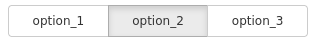
Widget_type.radioButtonGroupexamplefrom bokeh.io import show # for quick testing, not necessary in scPantheon extension from scpantheon.buttons import Widget_type, make_widget def callback(): pass RadioButtonGroup_wid = make_widget( Widget_type.radioButtonGroup, callback, labels = ['option_1', 'option_2', 'option_3'], active = 1 ) show(RadioButtonGroup_wid) # for quick testing, not necessary in scPantheon extension
- class slider
An alias of Slider
- start: NonNullable(Float) = Undefined
necessary_param, the minimum allowable value.
- end: NonNullable(Float) = Undefined
necessary_param, the maximum allowable value.
- value: NonNullable(Float) = Undefined
necessary_param, Initial or selected value.
- step: Float = 1
necessary_param, the step between consecutive values.
- title: Nullable(String) = ''
core_param, label of Slider.
- show_value: bool = True
core_param, whether or not show slider’s value..
- format: Either(String, Instance(TickFormatter)) = '0[.]00'
core_param, format of value display.
- orientation: Enum(Enumeration(horizontal, vertical)) = 'horizontal'
core_param, orient the slider either horizontally (default) or vertically.
- bar_color: Color = '#e6e6e6'
core_param, color of the range bar. Acceptable values are:
any of the named CSS colors, e.g
'green','indigo'RGB(A) hex strings, e.g.,
'#FF0000','#44444444'CSS4 color strings, e.g.,
'rgba(255, 0, 127, 0.6)','rgb(0 127 0 / 1.0)', or'hsl(60deg 100% 50% / 1.0)'a 3-tuple of integers (r, g, b) between 0 and 255
a 4-tuple of (r, g, b, a) where r, g, b are integers between 0 and 255, and a is between 0 and 1
a 32-bit unsigned integer using the 0xRRGGBBAA byte order pattern.
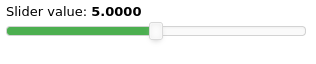
Widget_type.sliderexamplefrom bokeh.io import show # for quick testing, not necessary in scPantheon extension from scpantheon.buttons import Widget_type, make_widget args_slider = { 'start':0, 'end':10, 'value':5, 'step':0.1, 'title': "Slider value", 'orientation':"horizontal", 'show_value':True, "format":"0.0000", 'bar_color': '#4caf50', } def callback(): pass Slider_wid = make_widget(Widget_type.slider, callback, **args_slider) show(Slider_wid) # for quick testing, not necessary in scPantheon extension
- class rangeSlider
An alias of RangeSlider
- start: NonNullable(Float) = Undefined
necessary_param, the minimum allowable value.
- end: NonNullable(Float) = Undefined
necessary_param, the maximum allowable value.
- value: NonNullable(Tuple(Float, Float)) = Undefined
necessary_param, Initial or selected range.
- step: Float = 1
necessary_param, the step between consecutive values.
- title: Nullable(String) = ''
core_param, label of rangeSlider.
- show_value: bool = True
core_param, whether or not show slider’s value..
- format: Either(String, Instance(TickFormatter)) = '0[.]00'
core_param, format of value display.
- orientation: Enum(Enumeration(horizontal, vertical)) = 'horizontal'
core_param, orient the slider either horizontally (default) or vertically.
- bar_color: Color = '#e6e6e6'
core_param, color of the range bar. Acceptable values are:
any of the named CSS colors, e.g
'green','indigo'RGB(A) hex strings, e.g.,
'#FF0000','#44444444'CSS4 color strings, e.g.,
'rgba(255, 0, 127, 0.6)','rgb(0 127 0 / 1.0)', or'hsl(60deg 100% 50% / 1.0)'a 3-tuple of integers (r, g, b) between 0 and 255
a 4-tuple of (r, g, b, a) where r, g, b are integers between 0 and 255, and a is between 0 and 1
a 32-bit unsigned integer using the 0xRRGGBBAA byte order pattern.
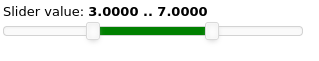
Widget_type.rangeSliderexamplefrom bokeh.io import show # for quick testing, not necessary in scPantheon extension from scpantheon.buttons import Widget_type, make_widget args_Rangeslider = { 'start':0, 'end':10, 'value':(3,7), 'step':0.1, 'title': "Slider value", 'orientation':"horizontal", 'show_value':True, "format":"0.0000", 'bar_color': 'green', } def callback(): pass RangeSlider_wid = make_widget(Widget_type.rangeSlider, callback, **args_Rangeslider) show(RangeSlider_wid) # for quick testing, not necessary in scPantheon extension